Heatmaps
HeatMaps
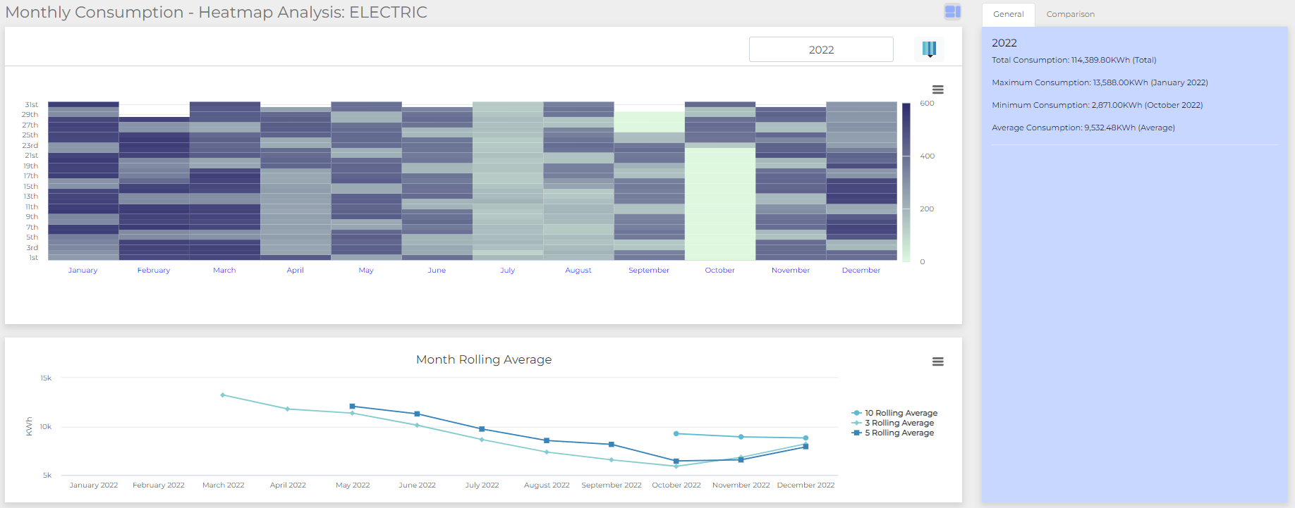
A heatmap is a two-dimensional matrix, which simply makes use of a colour scale to indicate higher or lower periods of (in our case) energy consumption. The deeper or warmer the colour is, the greater the amount of energy consumed. The colder or lighter the colour, the lower the amount of energy consumed. Allander Analytics’ BuildingBook software makes use of Energy Heatmaps as an extremely powerful way to visualise large amounts of building energy data at a glance.
Data analysis can leverage predictive analytics models to forecast future energy consumption based on historical data, weather patterns, occupancy trends, or other relevant factors. These forecasts can aid in proactive energy management, optimising building operations, and implementing demand response strategies. By identifying peak usage periods or potential energy spikes, energy loads can be managed more effectively, leading to energy savings. Heat maps also show patterns within energy and gas consumption on a timed basis. This can be used to help us further understand the needs of a building and how to further save costs. Heat maps also allow us to identify easily peak usage times and easily compare the data to the time of day to spot any potential errors or breakdowns.